The Problem:
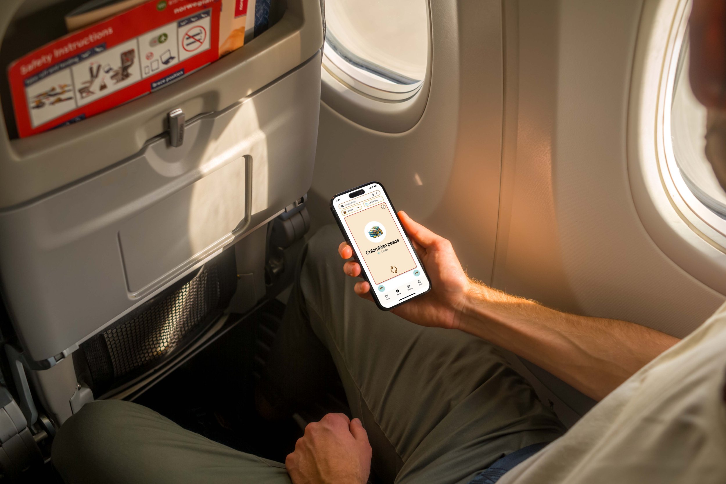
Young people backpacking through Latin America want to improve their Spanish language skills. They need a simple way to save and review the new words and phrases they are learning in their daily life.
The Product:
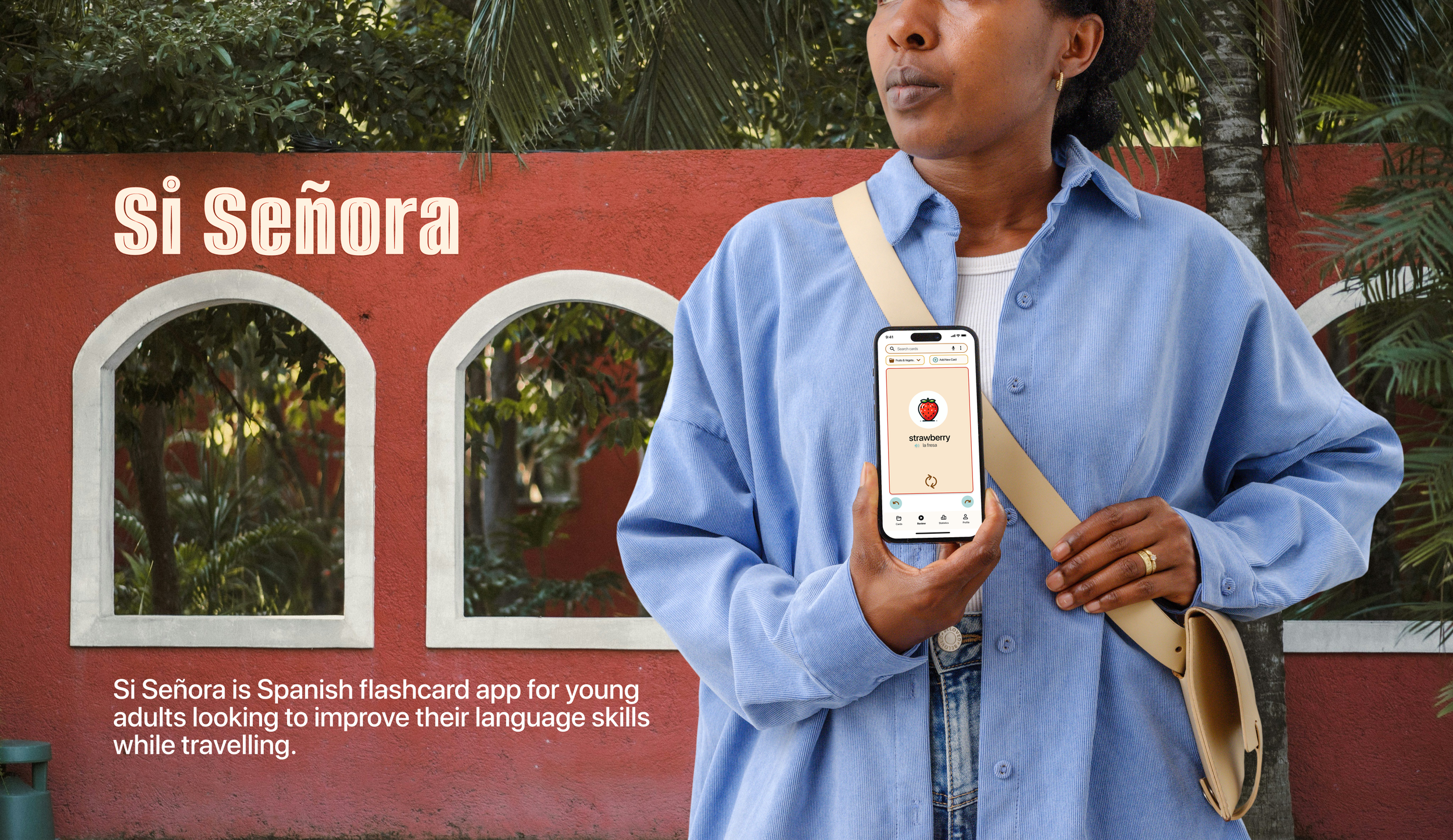
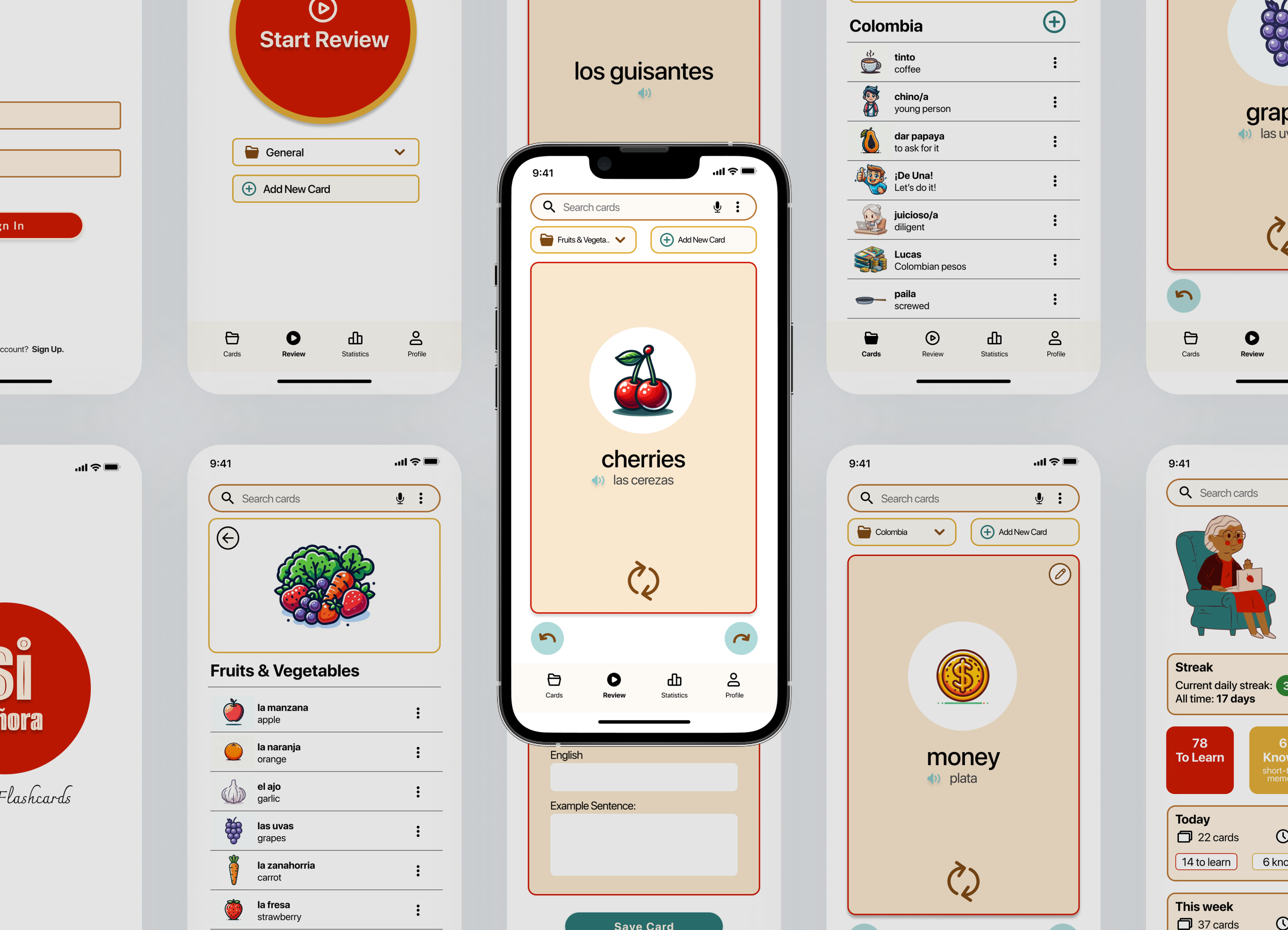
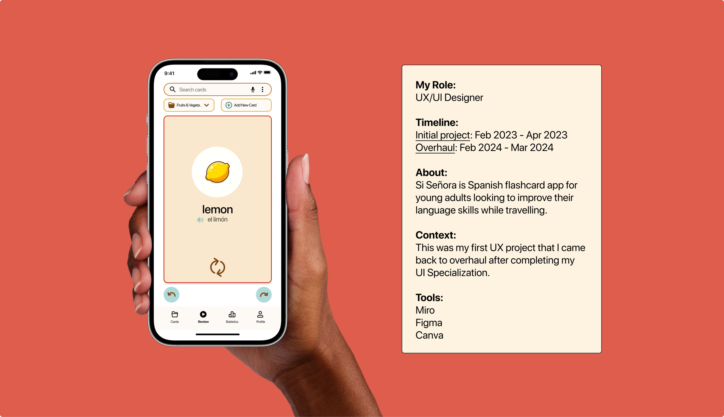
I designed an app where users can create their own flashcards or review pre-made decks. Users can add illustrations, hear the word auditory, and view their stats to see how quickly they are improving.
The Design Thinking Process
Adapted from the Nielson Norman group
Understand
Empathize
Define
Explore
Ideate
Prototype
Materialize
Test
Implement
Competitor Analysis
I needed to get an idea of what flashcard apps were currently on the market and how they worked, so I looked at three different applications: AnkiDroid, Quizlet, & DuoCard.
Importance of first impressions
I was struck by how important simplicity and an attractive color scheme influenced how I expected my experience to go.
Defined audience makes for a better app
I found that AnkiDroid as a general flashcard app fell a little flat. DuoCard, specifically for language learning, was able to be more playful and speak directly to the user. While Quizlet seemed to do a lot of things only ok, and perhaps offered too many features to really excel in flashcards.
User Interviews
I needed to better understand how my target audience goes about acquiring a new language. How do they learn, what tools do they use, how much time do they have?
The process
To gain insight about my audience’s routine, motivations, frustrations, habits, and tools I interviewed 4 people between the ages of 23-31 who all were actively learning a new language.
I asked each interviewee the same 6 questions and interviews lasted around 20 minutes.
What my potential users were:
Thinking
I would prefer if an app is well designed but the content is more important.
I believe language apps need to have multiple functions, especially auditory/pronunciation.
Feeling
It's frustrating that it takes me so much repetition to learn just one piece of vocab.
It’s fun when apps give insights into how I am doing and provide game-like motivators.
Doing
I go on Reddit and ask friends about their language app recommendations.
I will pay for an app if it has good reviews.
User Persona
I needed to narrow my focus and define my audience. Since I was travelling in Latin America, I decided to take inspiration from my own life, and the people around me, to create a flashcard app specifically for young adults on the move who wanted to improve their Spanish.
Strong Motivations
Learning Spanish isn’t simply a hobby for this user. Improving their language skills will allow them to:
communicate their daily needs,
improve personal safety,
better experience local culture,
and open up more financial opportunities.
Need help saying focused
The digital nomad is constantly on the go, exploring new cities and often staying in shared accommodation. Without a set routine or dedicated study space it can be hard to find the time to commit to something as big as learning a new language. It’s clear the app would need compelling motivators.
On the fly
Often the most important vocabulary for the user was what they came across in their daily life. Being able to quickly save “lechuga” while grocery shopping, and then being able to easily find it later, was what mattered most.
User Flow
I needed to get clear on how user’s would upload the new words and terms they were learning, as well as access and review the vocabulary they saved. I created some User Flows to establish what the steps would look like from a user getting on the app, to feeling confident they’d remember a new word.
“Why’d you swipe right?”
Since my audience is 18-35 year old’s, I decided to rely on design conventions users would be familiar with: dating apps. When the user knew the term they would swipe right, equivalent to “liking” someone on Tinder or Bumble. If they didn’t know it they would swipe left and the word would come back for further review.
Sketches
After defining my user (digital nomad in Latin America), identifying their needs (save & review vocab), and clarifying the steps to achieve their goal (repetition & repetition), it was time to start sketching out what this all might look like put together.
Save Vocab
Review Vocab
Concerns:
Busy Screen
I wanted to offer my user all the desired functionalities I had listened to so carefully during the interview stage, but I was now worried that they would distract from being able to focus while studying.
Discover or Explore?
I wanted to offer users some pre-made decks of cards so they could hit the ground running, but I wasn’t sure what icon or label to use for this purpose.
Low-Fidelity Wireframes
It was time to bring to life the design digitally, so I created some simple screens in Canva and loaded them into Marvel to prototype.
Save Vocab
Review Vocab
User Testing
Now came the time to put my design to the test — literally. I wanted to see if it was easy and intuitive for users to add new flashcards and review vocabulary.
The process
I conducted 10 minutes sessions with 5 people prompting them with the following four tasks:
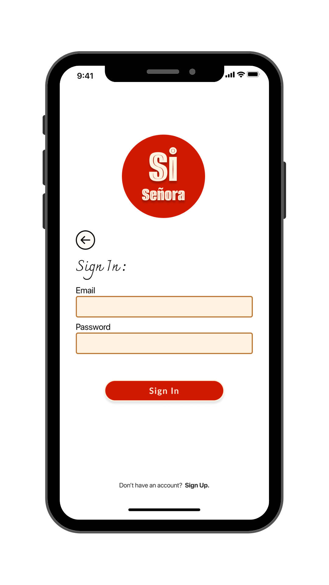
Sign up and log in
Add & save a new flashcard
Review flashcards
Navigate to settings page
I conducted the majority of the sessions in person using my Google Pixel phone. For the online sessions I had participants use their personal device.
Testing Takeaways:
Swiping woes
Overall people were confused as to how to navigate through the deck of cards. Some thought the blue “add new card” icon was how to advance through the deck. While others, who’s instinct was the swipe right or left, still had trouble.
The prototyping software did not allow for overlapping hot spots so users had to only touch and swipe the right side of the screen to advance through the deck. This type of precision was not practical for the task of quickly flipping through a set of cards.
Hierarchy
Some users found the size and color of the blue icons to be distracting, saying they took attention away from the task at hand - reviewing the card.
One user suggested offering a “play” mode were users can enter into a study or focus screen where all icons are hidden to focus just on reviewing the term. While another suggesting removing them all together.
It was clear the layout needed serious work.
Unlimited flips
Multiple users communicated the sense of “having the rug pulled out from under them” after they turned the card over to see the translation and their only options were to swipe right or left to continue through the deck.
The overall sentiment was that cards should be able to be flipped back and forth between Spanish and English, with a single tap, without limit.
I had to figure out a better, more intuitive way for users to advance through the deck.
Mid-Fidelity Wireframes
After a challenging round of testing, it was clear I need to upgrade to a more sophisticated prototyping software. So I got to work transferring my design into Figma.
Save Vocab
Review Vocab
Main differences:
I changed the order of the navigation bar
I removed the blue icons: back, edit, add new card, for a cleaner look
Concerns:
Oversimplified
After overhauling the design and taking another look, I feared I took the tester feedback too much to heart by removing the blue icons. While their appearance was flawed, the did provide access to important functionalities.
Busy Navigation Bar
Having five icons on the lower navigation bar all that a large size made the design feel overwhelming despite the removal of the other icons.
Si Señora Title
I let my love for the name of the app and font choice overlook practicality. The Si Señora title was taking up valuable real estate so I scrapped it in future versions.
High-Fidelity Wireframes
After months away from the project I came back with fresh eyes and a whole lot more design knowledge to overhaul Si Señora once more.
Revamping the Card Layout
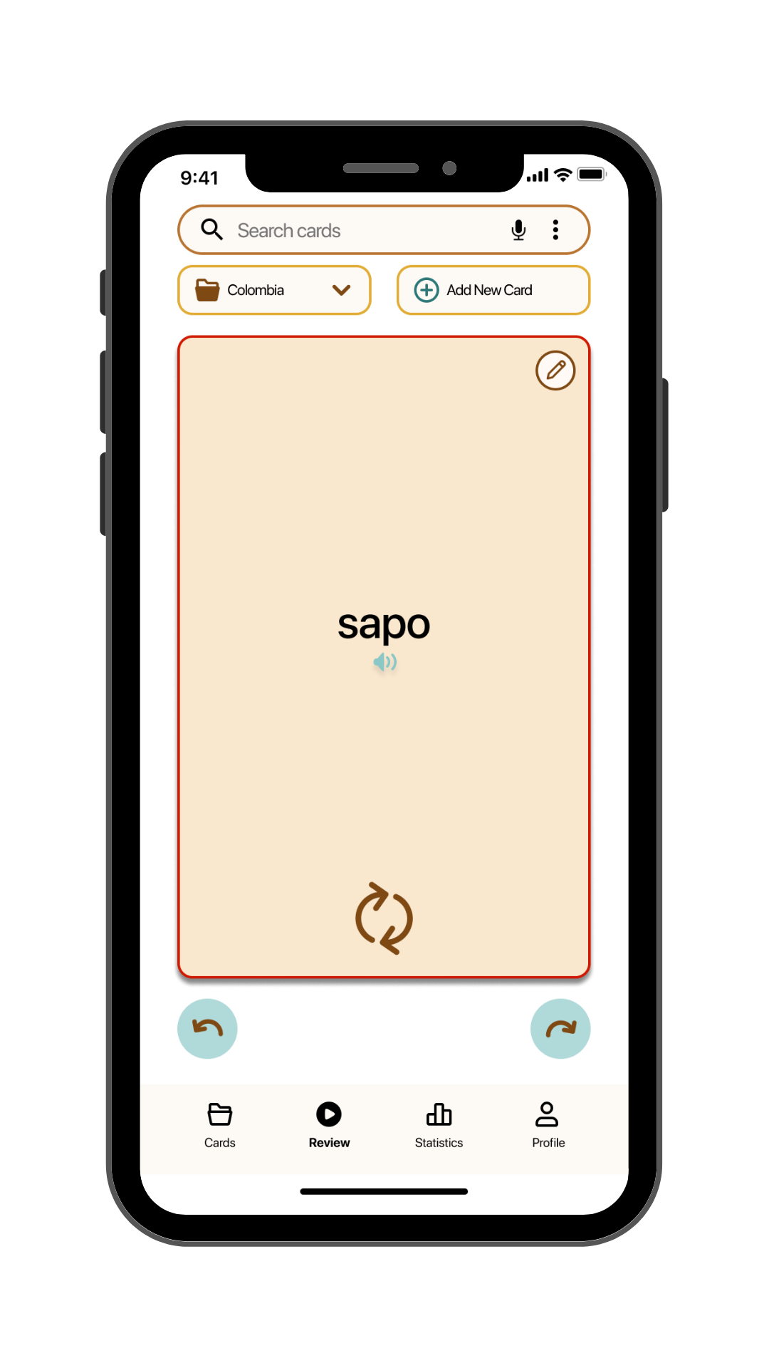
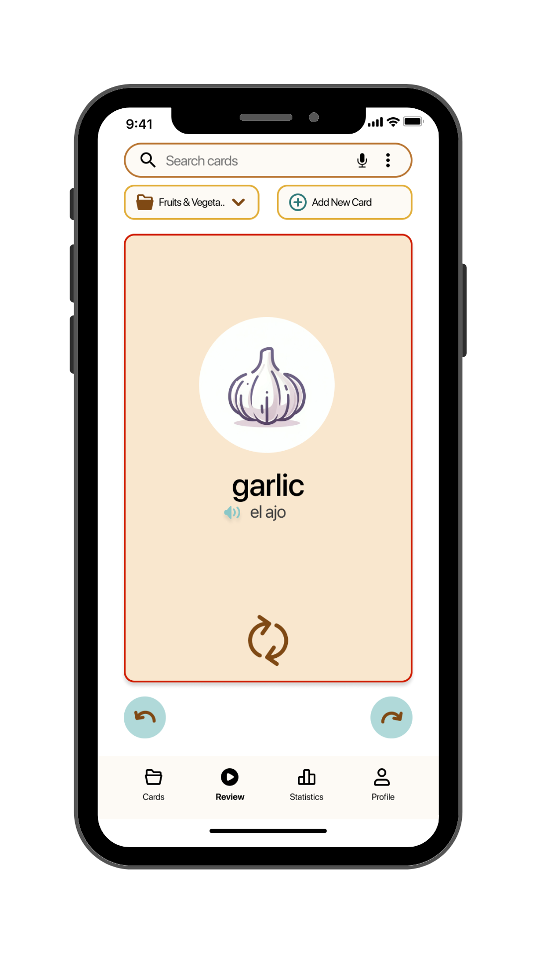
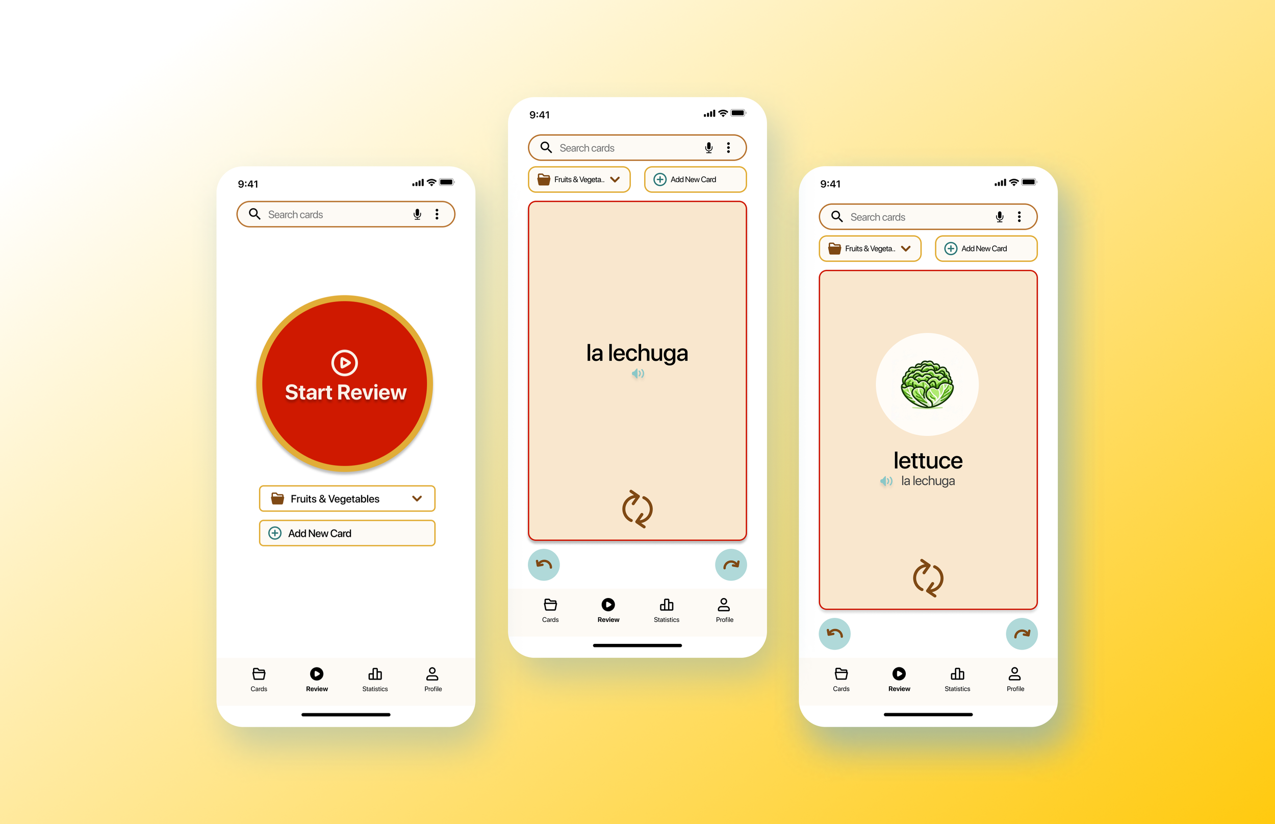
Enlarging the cards, incorporating bold text, and strategically placing icons helped alleviate previous hierarchy issues. This adjustment not only improved clarity but also allowed for the addition of crucial features, such as indicating the current deck being reviewed.
Plus, I spent ages perfecting the card flip animation, so now you can flip them endlessly, just like the testers wanted.
Optimizing Navigation and Interaction
I ditched the whole swipe thing (for now) and went for simple buttons to move through the cards. I’d like to see how this flies with users in testing.
For future versions I’m toying with the idea of combining the interactions by keeping the tap-to-flip feature and enabling deck navigation via swiping gestures. This could really spice up the whole experience.
Streamlining Access to Essential Features
Took a page from past projects and made sure the main event – the cards themselves – are just a tap away under the far-left icon of the navigation bar.
From this central hub, users can effortlessly access both their custom card sets and the pre-made sets bundled with the app. By doing this I cleared up space in the navigation bar since a separate “discover/explore” page was no longer needed.
Final Design
Learnings
I learned a lot about balancing my own instincts with that of feedback from test subjects. I came away with a much deeper understanding of how to use Figma, specifically prototyping individual components.
Next Steps
I definitely need to put Si Señora through user testing again as the majority of changes I made were on based on my increased knowledge about design conventions. I need to see if that lines up with how users will navigate the app in real life.
