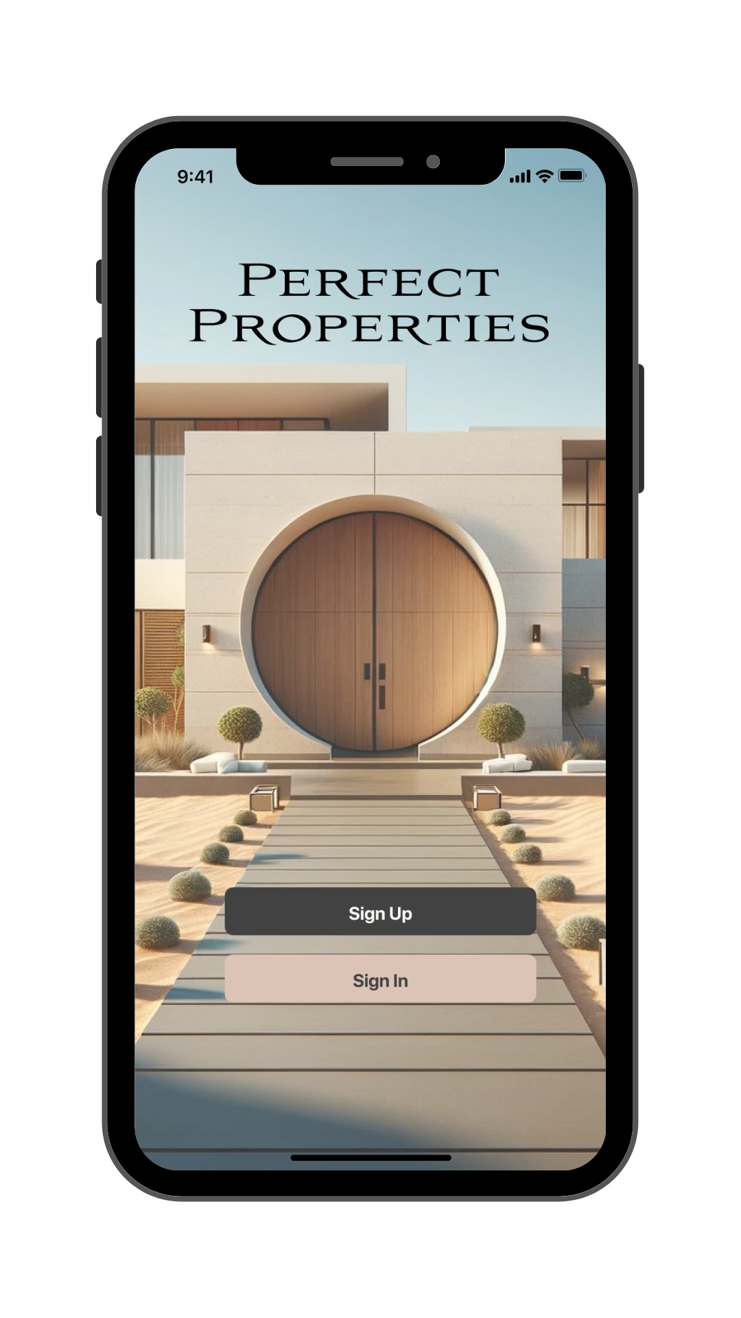
Perfect Properties
A responsive web app to find & research real estate listings, contact agents, and get the perfect place.
Project Objective
How might we simplify the home buying process so people can find all the information they need in one place?
How might we make it easy to get in touch with a real estate agent so people can get into the market quickly?
The Product
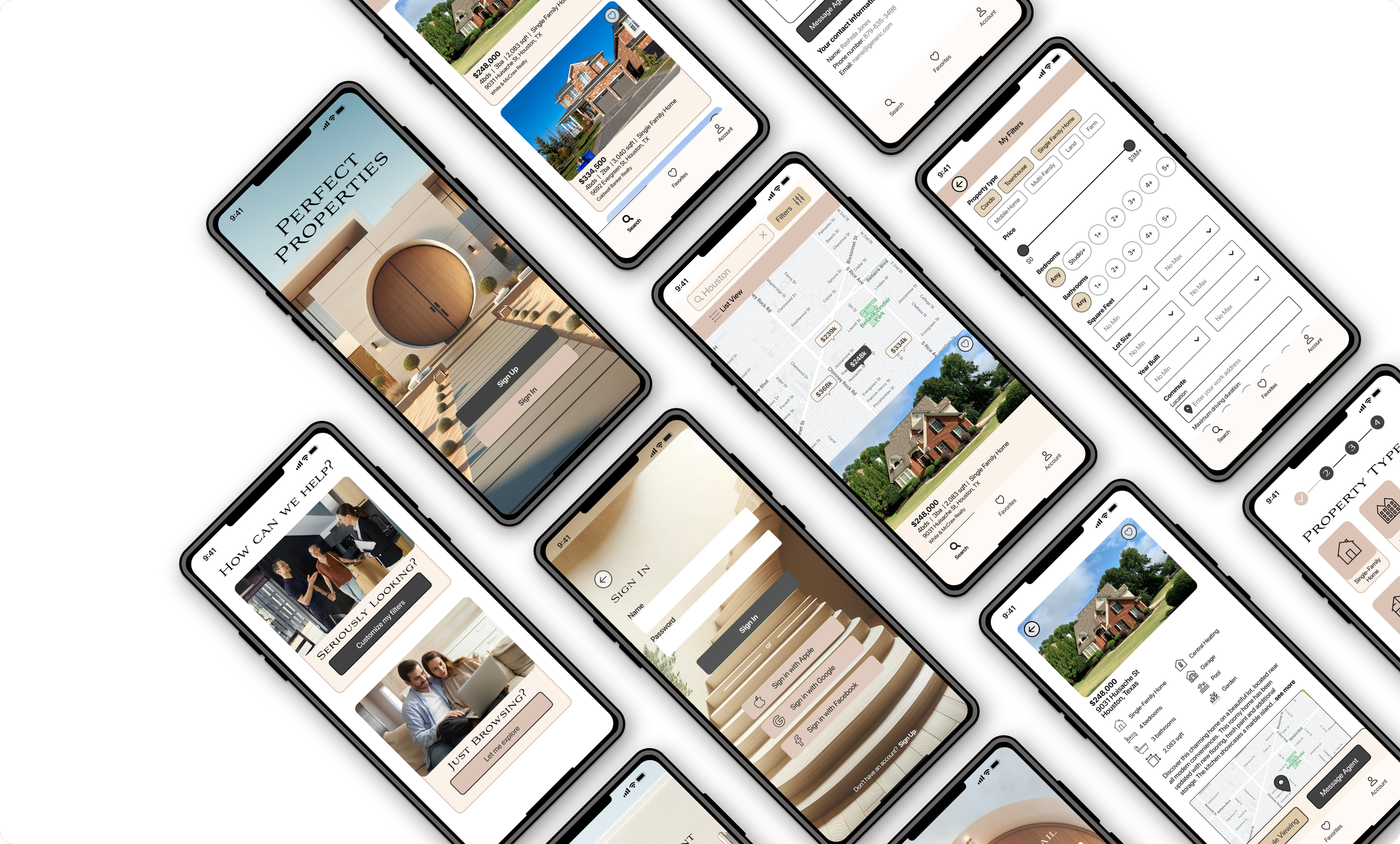
Designed an app that allows users to:
sort listings based on location radius,
save their filtered searches & favorite properties,
calculate their commute,
and contact real estate agents directly to set up viewings.

The Design Thinking Process
Adapted from the Nielson Norman group
Understand
Empathize
Define
Explore
Ideate
Prototype
Materialize
Test
Implement
Mood Boards
I needed to establish a brand identity that would communicate to users that Perfect Properties is a reliable source of information that will connect you to professionals.
Staying On-Brand
I created two different mood boards with two distinct styles but both in line with the original brand guidelines of “clean, quick & smart.”
Audience
While I liked the slick, futuristic look of the second mood board, I came back to my persona: a hardworking professional looking to get into the real estate market with an investment property.
The second board would perhaps work for a luxury real estate brand, but not so much for the everyday person looking for something sensible. So I moved forward with the more down-to-earth design.
Proto-Persona
To better understand the user’s needs, motivations and pain points, I created a proto-persona using the information outlined in the project brief.
User Flow
I created a user flow to outline the path from:
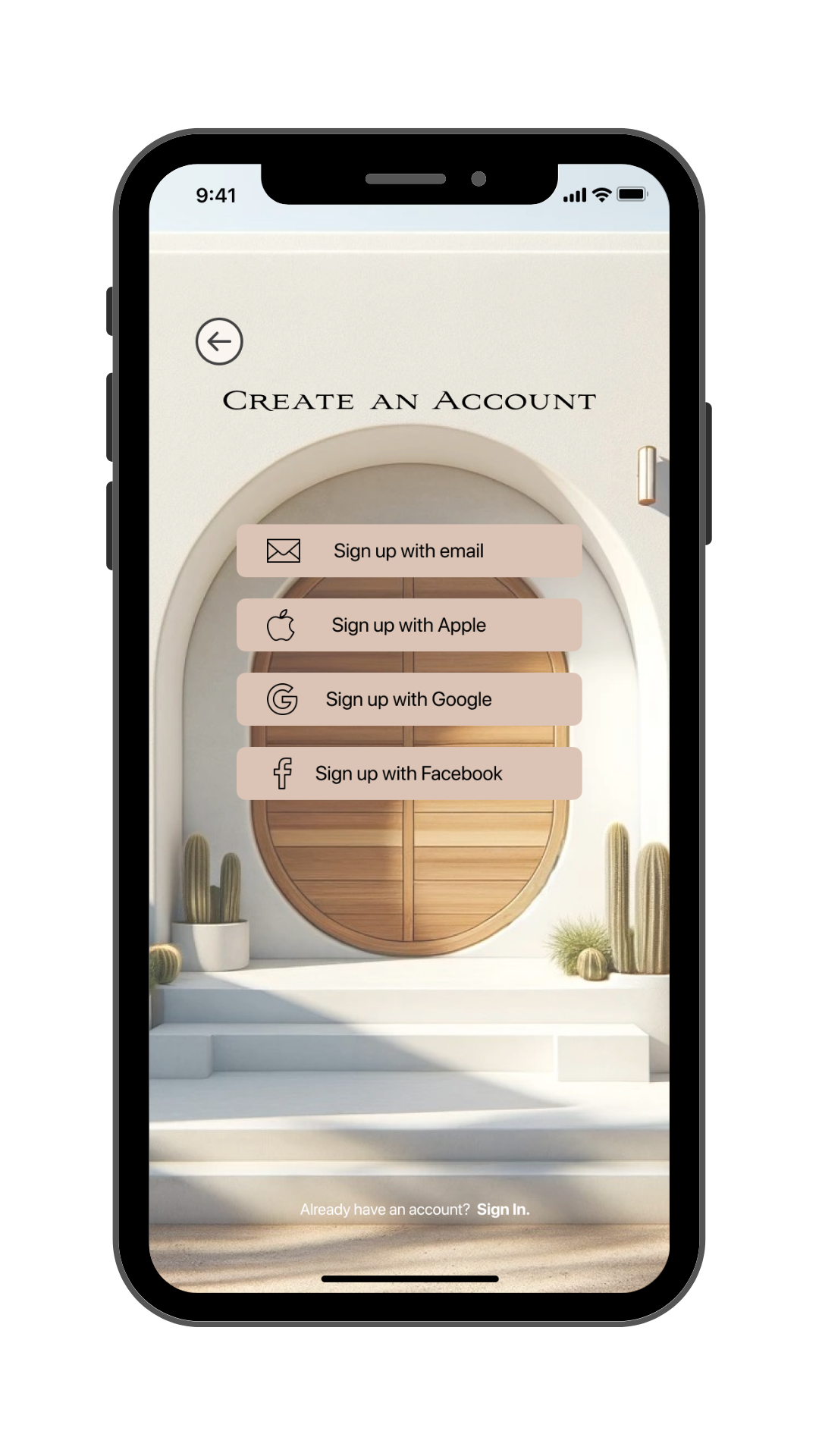
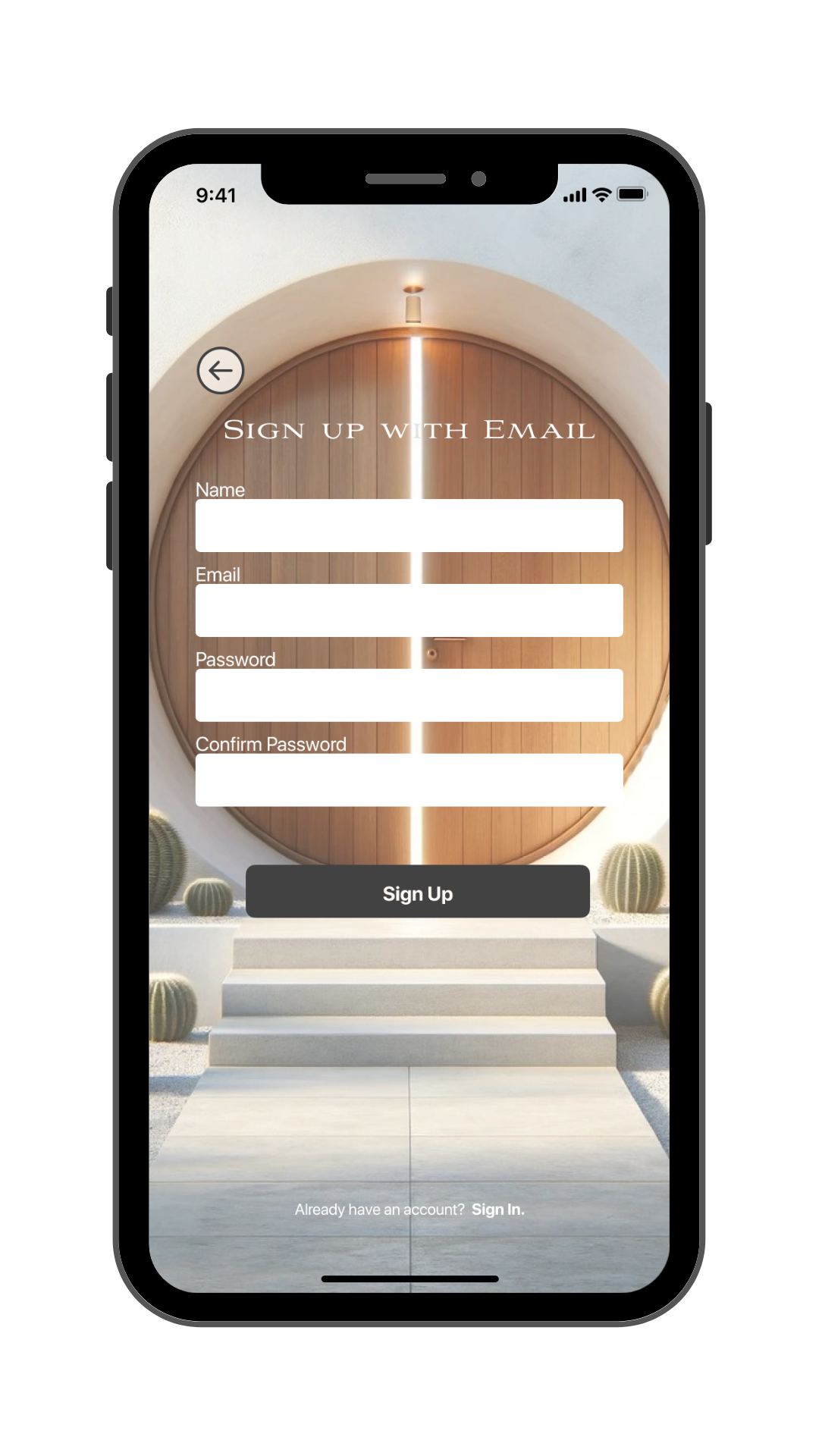
signing up,
creating a customizable search,
finding a desirable property,
and contacting a real estate agent.
Saving Filters
Through the User Flow it became clear that users would need a way to save their ideal property criteria so they could keep coming back to the same filtered search easily.
Saving Properties
Users need a way to save their favorite properties so they can show the people in their life easily before they make the decision to reach out to the realtor.
Sketches
I needed a way to quickly visualize the screens and get an idea of functionality required, in line with the user stories outlined by the proto-persona in the project brief.
Sketched screens to address three user stories:
Search for and bookmark properties,
Save property criteria & filter search,
Access info on the property and contact the agent
Card animations
Through sketching it became clear that navigable cards is what would make or break this user experience.
Low-Fidelity Wireframes
I then began transferring my sketches to some simple digital wireframes to get an idea of what they’d look like on a device.
Tools Used
First I used Balsamiq to make some low-fidelity wireframes and then I transferred this idea in greyscale into Figma.
Main Changes
I stopped using the terminology of “My Criteria” and only “Filters” to ensure consistency.
Mid-Fidelity Wireframes
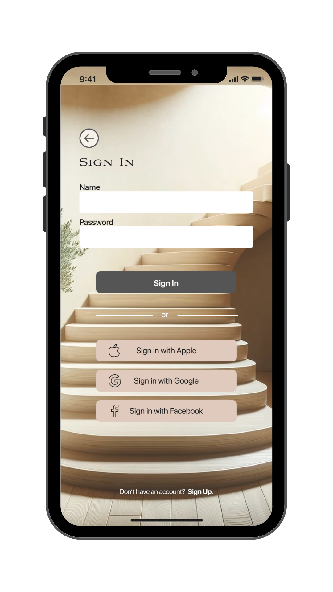
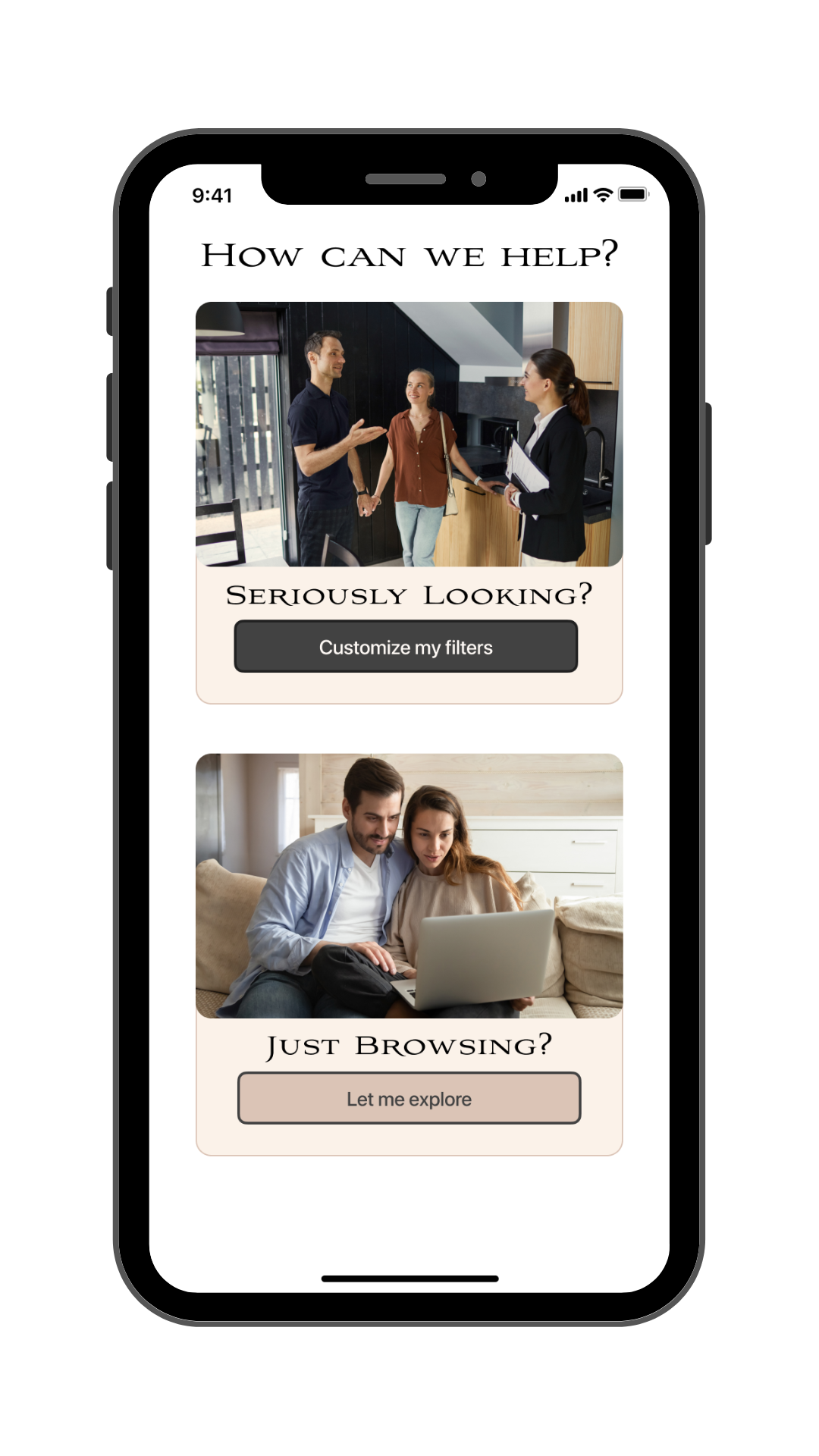
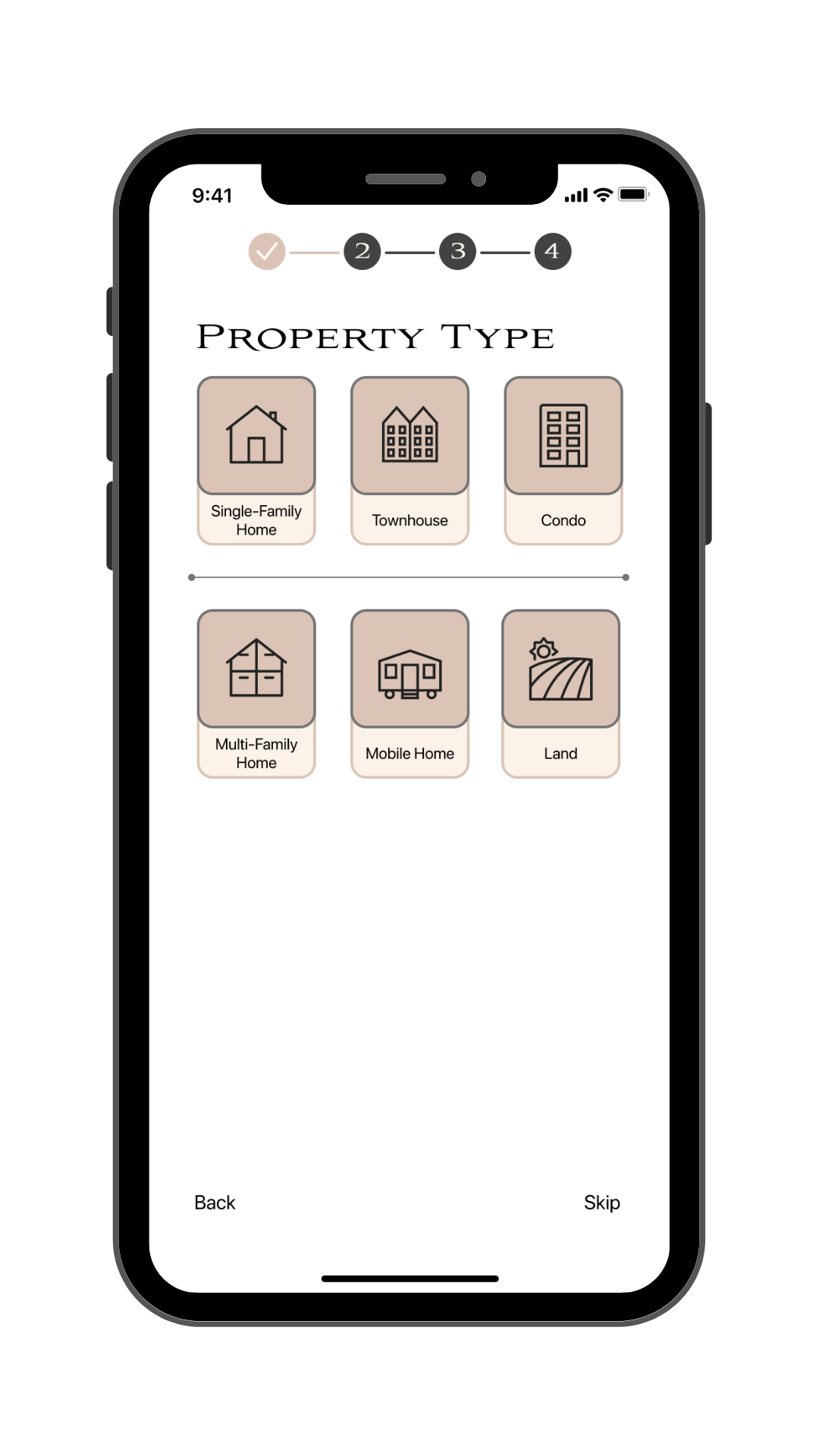
I began adding color, icons, and images in line with the mood board to start to bring the design to life.
Getting Tough
Map View
I took another look at the products currently on the market and realized that they make use of the whole phone screen for the map. In the next iteration I scrapped the small square map and had the map take up all available space.
Screen Titles
Related to the map view, I realized the screen titles were taking up valuable screen space and somewhat redundant given the existence of the bottom navigation bar. So I scrapped them in future versions.
Blue Contrast
The blue I had to use in order to pass accessibility tests (when used as a background with light text), was so dark, nearly black. As such, it didn’t provide visual interest alongside the greys and blacks I was already using so I decided to scrap it.
Style Guide
To ensure consistency across the design, finalize the color palette, and have a document to refer back to, I developed a style guide.
Colors
Perfect Properties has five main colors that contribute to the brand identity.
Grey and rose are the primary colors while gold acts as an accent. Cream is used for the navigation bars and beige for the card backgrounds.
Logo
Primary logo color is rose, for when it appears alone. To contrast with desktop and tablet bar it appears in cream. Icon itself is in grey.
When accompanied with text it is consistent with the rest of the application, Avion size 32 in black 00000.
UI Elements
Navigation Bar
393 x 56
Large Buttons
260 x 40
Medium Buttons
150 x 40
Iconography
Color: 424242
Stroke Size: 1
Default size: 24x24 px
Small size: 48x48 px
Large size: 80x80 px
Style: Subtle rounded edges, all in outline format
Imagery
Images used as part of the brand should be bright and ethereal, giving the feeling that dreams are possible.
This should come in the form of white geometric houses and interiors with wood accents and greenery.
Lighting should be bright with slight yellow tones.
Tablet & Desktop
While the user is often on the go, buying real estate is a big decision, and they’ll definitely be sitting down at a desktop at some point to organize their research. I needed to create a responsive design with multiple breakpoints, so that the user could access an appropriate amount of information, relative to their screen size.
High-Fidelity Wireframes
I combined all my design learnings so far, with a clear focus on functionality. I expanded the map size, removed screen titles, and changed location icons to price bubbles.
Learnings
At times I let my excitement over color schemes, animations and visual appearance take priority over functionality. I learned to come back to my roots as a UX Designer and get the essential user tasks dialed before investing hours sprucing up the onboarding experience. In this way, I know I will be able to reach a minimal viable product more quickly in the future.
Next Steps
As this was a UI focused project, the logical next step would be to perform user testing to see how the app holds up from a usability perspective. I’d also like to increase the complexity of the property card components, as well as animate the interactions on the onboarding screens.
