Culture Collision
A vibrant, centralized site for a culture-driven tradeshow, designed to simplify ticket sales and tournament sign-ups, while showcasing bold artwork and a unique style.
My Role: UI Designer
Timeline: Aug 2024 - Sept 2024
Tools: Figma, Adobe Illustrator, Adobe Photoshop
Team: Product Lead, UI Designer (me), Developer
The Challenge
The Culture Collision team needed a cohesive, colorful experience to replace their patchwork of Eventbrite pages. I had six weeks to create a bold, neobrutalist-styled site that incorporated existing artwork and laid the groundwork for a future user portal.
The Product
I designed a colorful, streamlined website that spotlighted the vibrant Simpson-style artwork of "Kid Culture" and featured easy-to-navigate ticket sales, tournament sign-ups, and waivers.
I ensured the site not only captured Culture Collision’s bold energy but also set the stage for future phases like a user portal and app to enrich the event experience.
The Design Thinking Process
Adapted from the Nielson Norman group
Understand
Define
Explore
Materialize
Refine
Implement
About Culture Collision
Culture Collision is a quarterly tradeshow specializing in sneakers, sports cards, and community.
Founders Raphael and Jade at a Culture Collision conventionIt’s not often you get to work with a client whose main visual direction is MORE COLOR but this was exactly the case when I started with Raphael and Jade. They had fallen in love with the neobrutalist aesthetic and wanted a site that reflected the openness and authenticity that defined their brand.
Project Overview
I got to work designing a site that centralized their affiliate links, showcased their existing artwork, and utilized the neobrutalist principles of saturated colors & opaque drop shadows.
Client previously used multiple EventBrite pages Initial Challenges:
Short timeline: Six weeks to launch.
Visual Direction: Bold colors, neobrutalist style, and existing brand artwork.
Client goals: Showcase value of a centralized platform, provide future community portal and app options.
Existing ArtworkKey Features:
Centralized ticket sales, tournament sign-ups, and email collection.
Bold design with existing artwork integration.
User-centered design focusing on ease of use and event immersion.
Took NeoBrutalist inspiration from Sepidy Yazdi and othersNext Phases:
Phase two: User portal for deals and community.
Phase three: Event app for live schedules, vendor maps, and a more interactive experience.
Competitor Analysis
I compared Culture Collision to competitors like Fanatics, which had a corporate, black-and-gold aesthetic that lacked warmth and a community vibe. This solidified our focus on creating an engaging, counterculture experience that appealed to sneakerheads, athletes, and collectors.
Competitor: Fanatics FestLanding Page
The landing page existed but needed visual enhancements and better navigation. With the event approaching in just over a month, I had to move quickly to deliver an appealing, user-friendly design.
Previous Landing Page:
The developer had quickly put together a landing page to have something live for the upcoming event. It used a few neobrutalist templates and had a decent layout, but the artwork needed more prominence, and the header text didn’t meet accessibility standards.
My Update:
I revamped the design, incorporating the Simpson-style blue sky and clouds. I enlarged the icons and cards, made the calls to action bolder, and adjusted the header text for readability. I also included Kid Culture character and integrated some of their event images.
Button Struggles
The dual flight buttons were tricky, but later on I resolved the issue on mobile by stacking them, which also worked well for desktop.
Client Feedback
"Too cloudy."
They were right—I had gotten carried away and the overload of clouds were taking away from the neobrutalist aesthetic. I toned it down and sent a revised version.
Style Guide
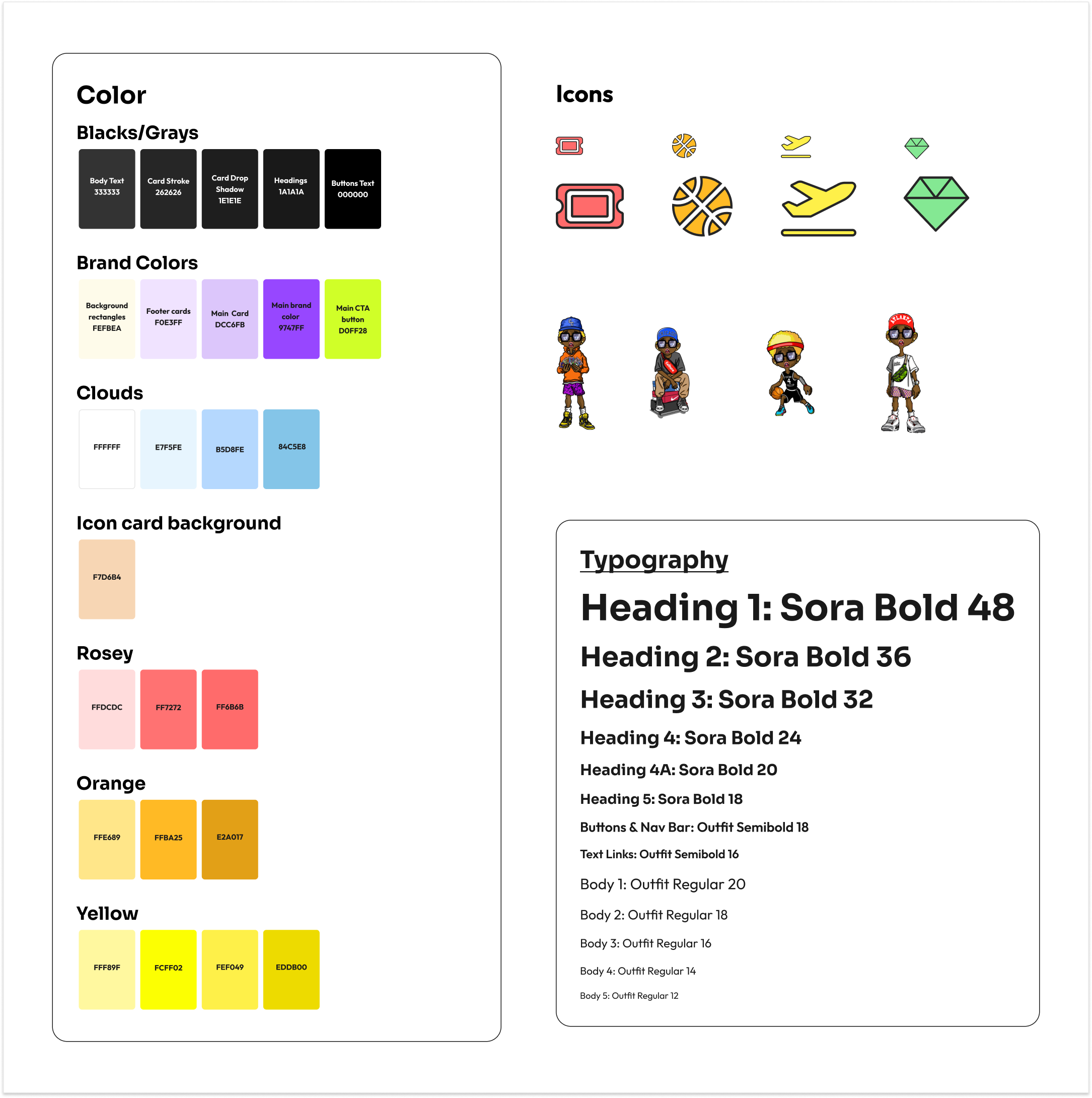
With the client’s approval on the landing page, I created a straightforward guide for colors, typography, and button styles, keeping the design clean and functional. This provided necessary clarity for the developer and clear visual direction as I went to build out the rest of the site.
Sketches
I made quick sketches to map out the bold and simple layout we needed. In addition to the landing page, we also planned an About Us, Tickets, Accommodation, Hoops, and Collectables page.
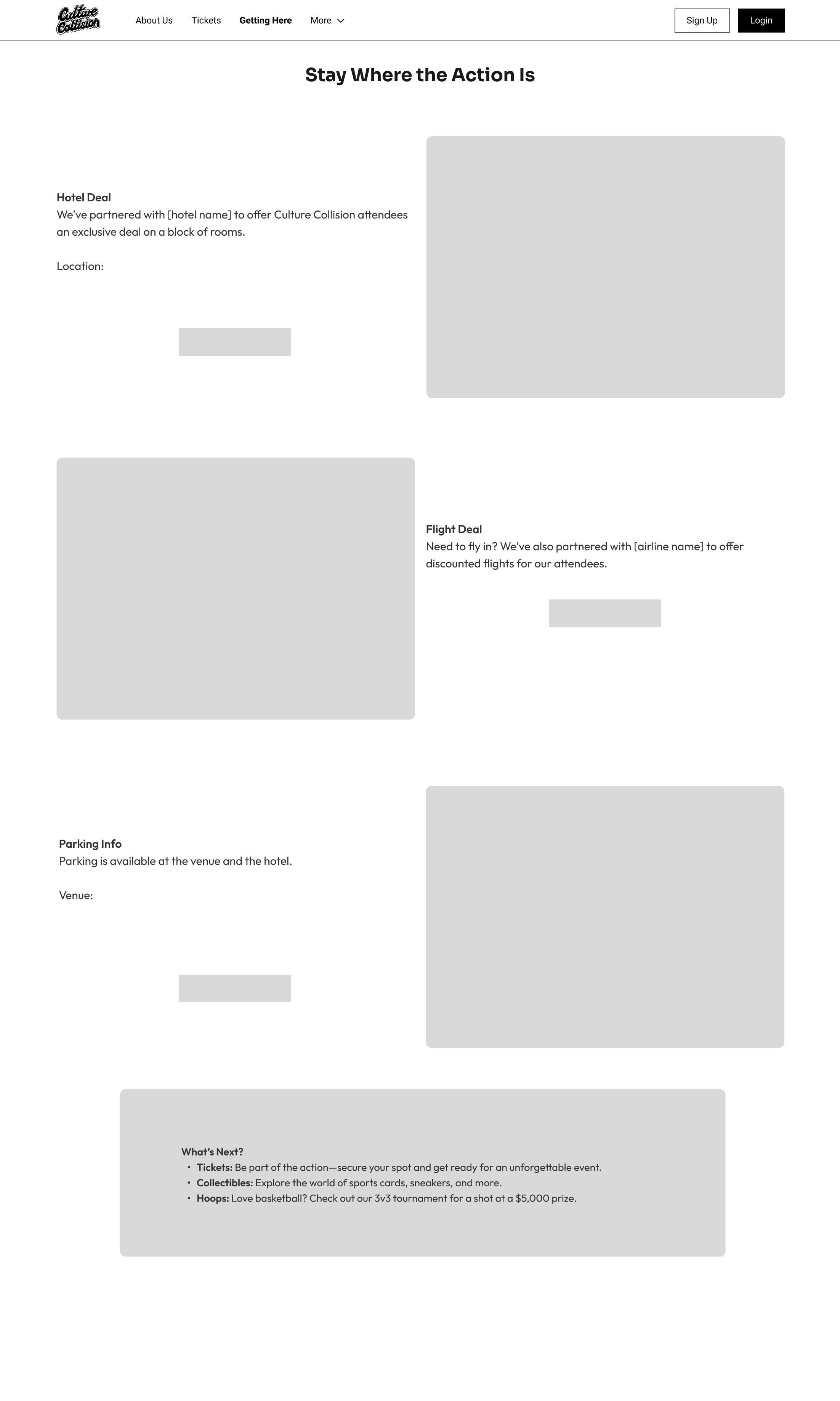
Accommodation Page Hoops Page Wireframes
I transferred my sketches into Figma wireframes, which helped me finalize the layout and copy before moving to high-fidelity designs. I also added a "What's Next" section to each page for easy navigation.
Accommodation Page Hoops Page High-Fidelity
I added color, images, and icons while minimizing the use of clouds to keep the focus on the bold, brutalist aesthetic. I decided to “color-code” each page: tickets were rosy, accommodation was yellow, and basketball (of course) was orange. The Collectibles page (mint green) was later scrapped.
Accommodation Page Hoops Page I combed through the Eventbrite pages to add ticket details and tournament requirements, ensuring the site wasn’t just pretty, but served its intended purpose.
Mobile
Maintaining the magic of the sky and clouds on mobile was challenging, so I reduced the size and shadow of the content cards to conserve space and minimize cognitive load. I used mobile-first principles by making buttons span the full width of the card, which I later carried over to the desktop version.
Accommodation Page Hoops Page Design System
I organized my assets for ease of use and to set the stage for scaling up for the January event. I used an atomic design system to ensure consistency across the platform.
Atoms
Molecules
Organisms
Final Desktop Design
I took the initiative to add the event schedule to the landing page, something that was buried in the Eventbrite description but seemed worth highlighting.
Final Mobile Design
Mobile-first design is key—I should have started there to avoid getting carried away.
Don’t be afraid of color! Normally, I use color sparingly, but this project was a crash course in using it boldly while maintaining accessibility. Neutral cards made a big difference.
Learnings
Develop the user portal and expand to an app to engage the Culture Collision community.
Research "comic book style" for the next event, as the client is considering changing the aesthetic!
Next Steps


