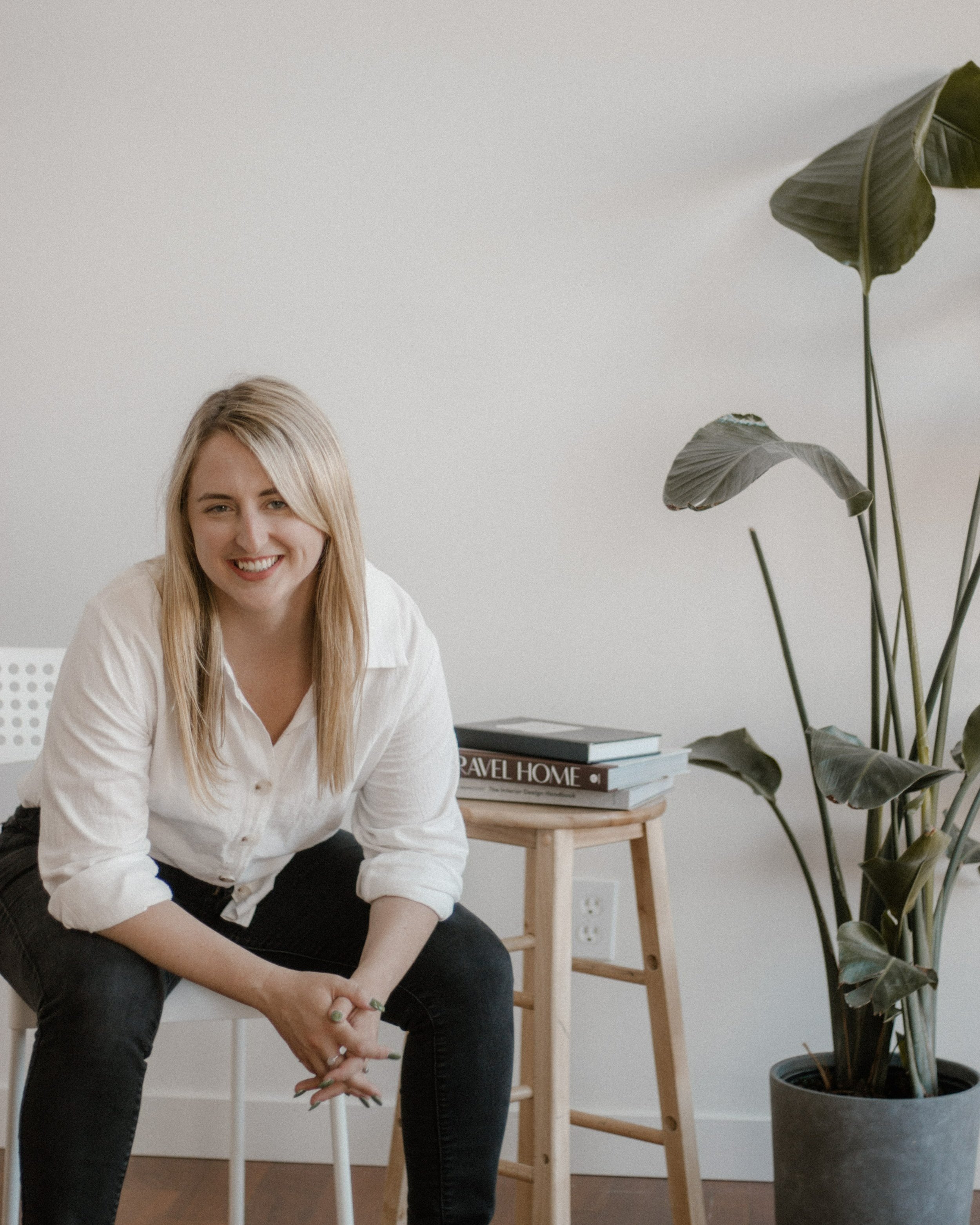
Beach Pulse
Coastal Forecasts You Can Count On.
Beach Pulse is a coastal forecasting app that provides easy to understand wind, wave, & weather reports to surfers, divers, sailors & beach bums.

The Goal
Develop a precise and user-friendly coastal forecasting app appealing to diverse users, from seasoned surfers to leisure beach visitors. By empowering users to plan their trips accurately, we aim to bolster their safety while saving them both time and money.

The Product
Designed an app that allows the user to:
save their favorite coastal locations,
view individual wave, wind, weather, & tide reports,
receive emergency alerts for their saved locations,
and access sport-specific resources.
The Process
User Research
While both taking place on the water, I knew first hand that the information I needed when planning a surf trip vs. a dive trip is markedly different. So I conducted one-on-one interviews with participants of different water sports to see what they were after when using a coastal forecasting app.
User Personas

Liam the Surfer
As a 27-year-old surfer from San Diego, Liam is our primary persona. Surfing is not one part of his active lifestyle, but also a central way he connects with his partner.
He needs both short and long-term forecasts that are accurate, detailed, and don’t glitch.

Angie the Diver
Angie’s a 35 year old scuba diver in Vancouver. She found a dive community and tries to go about once a month to hang out, have lunch, and keep up her certifications.
She wants convenience and simplicity. Getting all her dive info from one source would feel like a dream.
User Journeys

Liam the Surfer
Liam is planning his week and wants to pick the best day to go surfing after work with his partner.

Angie the Diver
Angie wants to compare her two favourite spots to decide where to dive with her buddies today.
Sketches
With a good idea of what information users would be looking for and what tasks they needed to complete, I took to pen and paper to start transferring my ideas onto a screen.

Keeping it simple
While I came out of user interviews with a million ideas, I decided to focus on the essentials in order to get to the minimum viable product as fast as possible. A coastal forecasting app would need:
Home
Conditions
Favorite Locations
Resources
Search
Settings
During rapid prototyping, I merged the Home button with the Conditions Snapshot screen to streamline access for users seeking immediate forecasts, thinking I was eliminating unnecessary navigation. Little did I know that would only come back to bite me later.
Wireframing
Satisfied with the structure, I began transferring my wireframes from paper sketches to low-fidelity digital wireframes.


Low Fidelity

Mid-Fidelity
Simplifying Navigation
As I increased fidelity it became clear that the hamburger menu was redundant, so I replaced it with a back arrow. Next, I moved the settings from the gear icon at the top to the account icon under the bottom navigation bar.
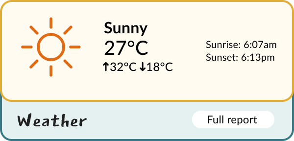
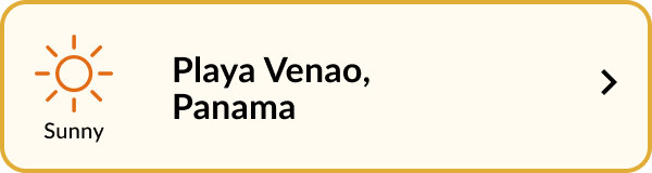
Creating Conditions Cards
As I began adding color and iconography, my main focus was the Conditions Page. I created a series of cards for weather, waves, and wind that would each link to their own more fulsome report.
-
![]()
Splash Screen
-
![]()
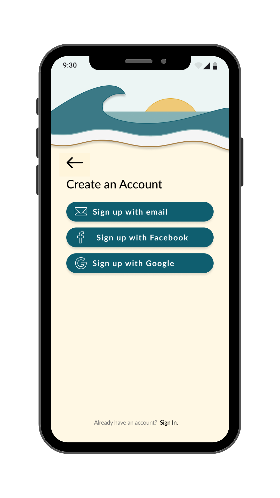
Create an Account
-
![]()
Onboarding - Welcome
-
![]()
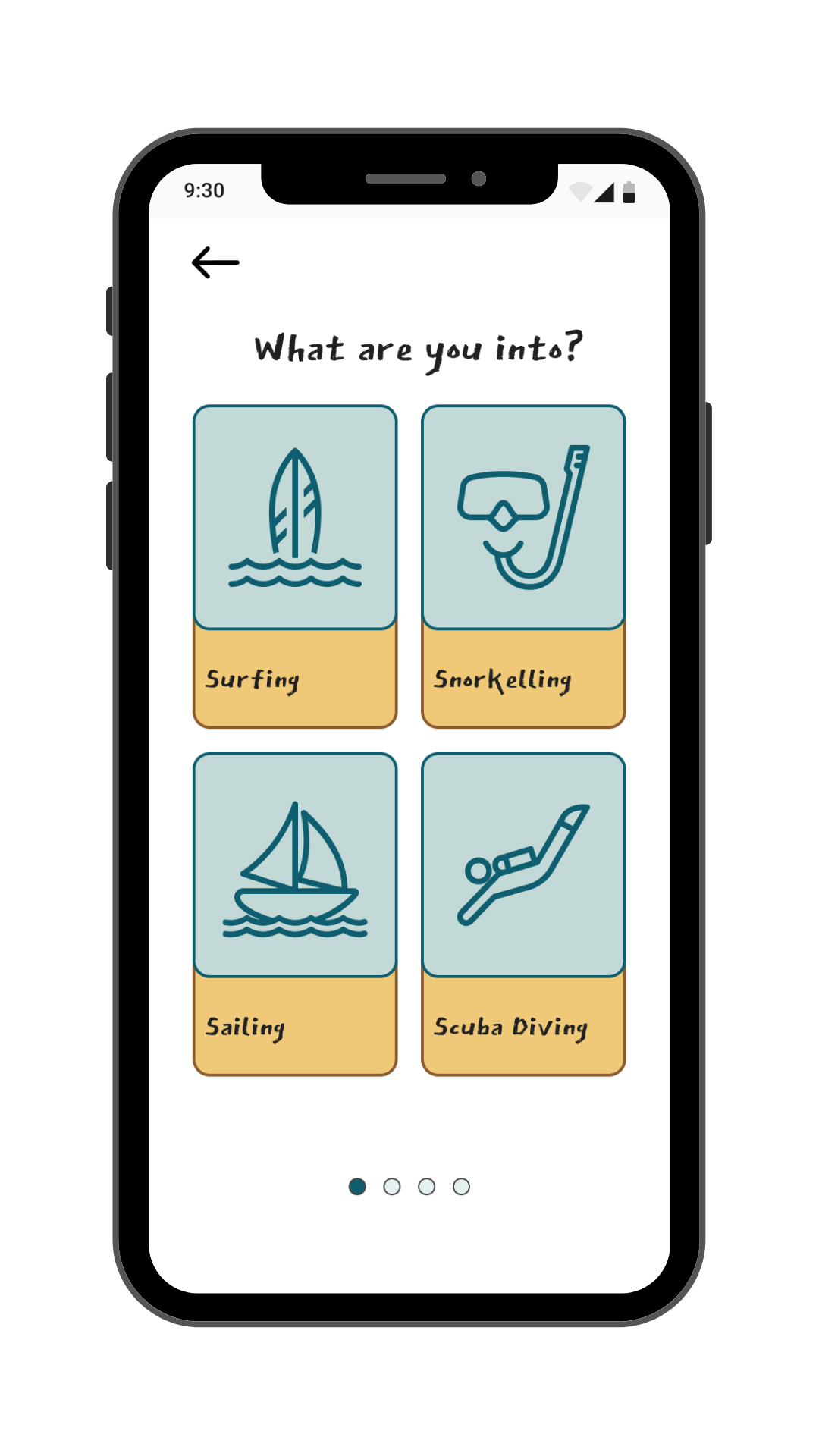
Onboarding - User's Activity
-
![]()
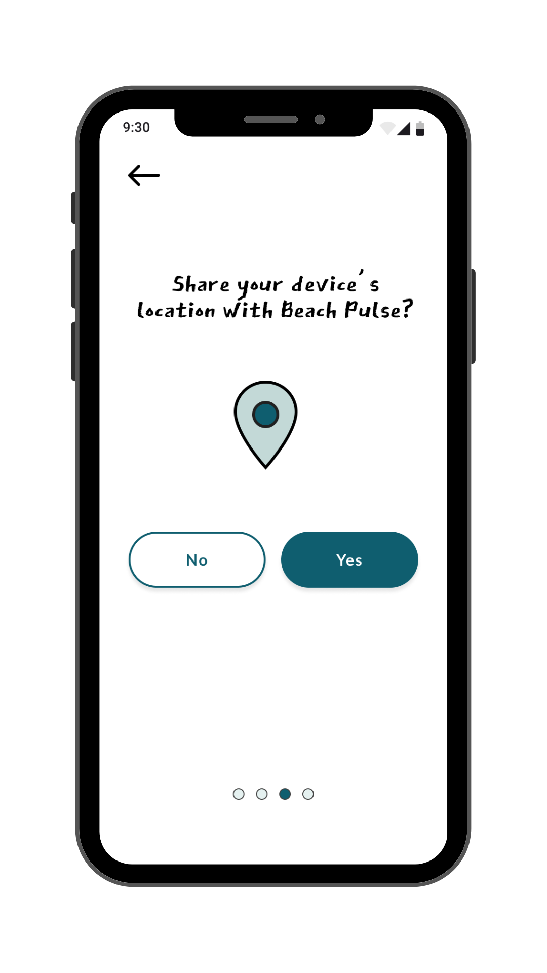
Onboarding - Share Location
-
![]()
Onboarding - Add Location to Favorites
-
![]()
Conditions Snapshot
-
![]()
Favorite Locations
-
![]()
Resources
-
![]()
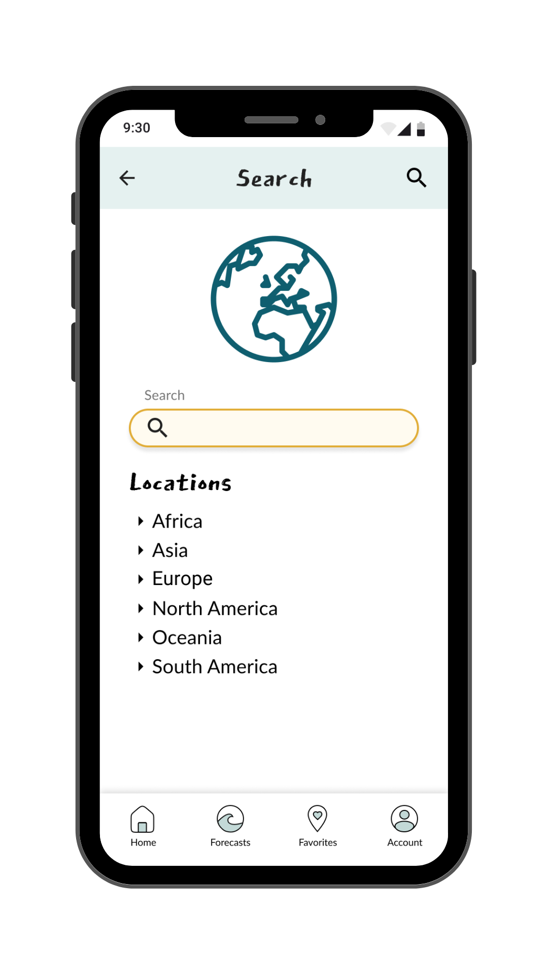
Search
-
![]()
Account
-
![]()
Emergency Report


User Testing
As the app started coming together, I wanted to make sure it was easy to use. So I gathered 7 people to test it out and see if they could complete key tasks.
Test Goals
Learnability
To assess the learnability for new users interacting with the forecasting application for the first time.

Value
To observe and measure if users understand the project, its value, and how to complete basic initial functions.

Navigation
Receive feedback on overall organization of the application and if users find the layout intuitive.

Test Questions
Search
You don’t live on the coast but would like to bookmark your favorite beaches. Using VELA, search for additional locations.
Emergency Alert
You are planning a day at the beach but want to make sure it’s safe for your group. Check your favorite locations and read any relevant reports.

More
You’re a beginner surfer and are interested in gaining some Tips & Tricks about the sport. Using VELA, find a guide that would help provide this information.
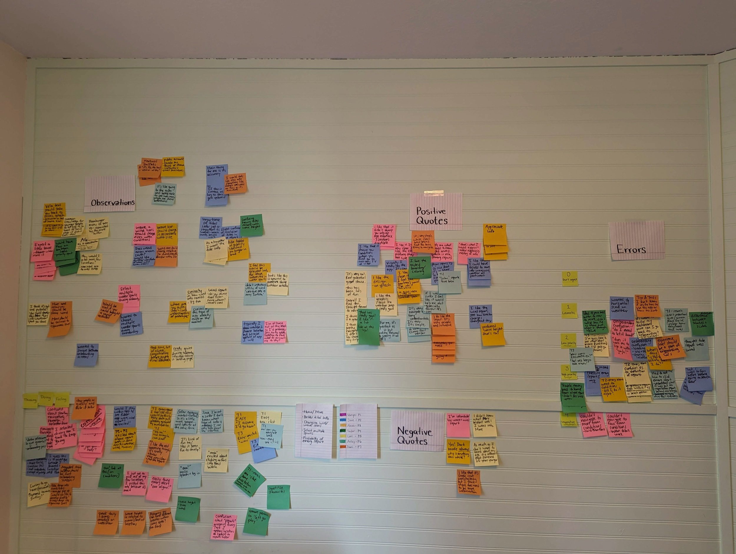
Affinity Map
Test Results
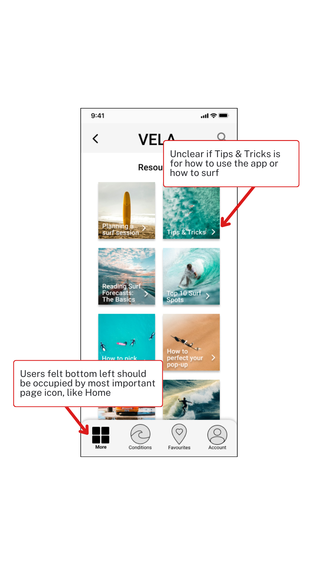
Dislike for the positioning of the More page
User testing revealed a strong preference among participants for the convention of placing the icon of the most crucial page, like the home page, in the bottom left of the navigation bar.
Functionality of the More page unclear
When a participant expressed uncertainty about whether "Tips & Tricks" pertained to app usage or surfing techniques, it highlighted confusion surrounding the content.
Resolving Issues
I needed to take action to address the user concerns that came up during testing.
Splitting Content for Clarity
User testing revealed that shoving two distinct functions into one page—providing resources for specific water sports and offering help with interpreting forecast information—wasn't working.
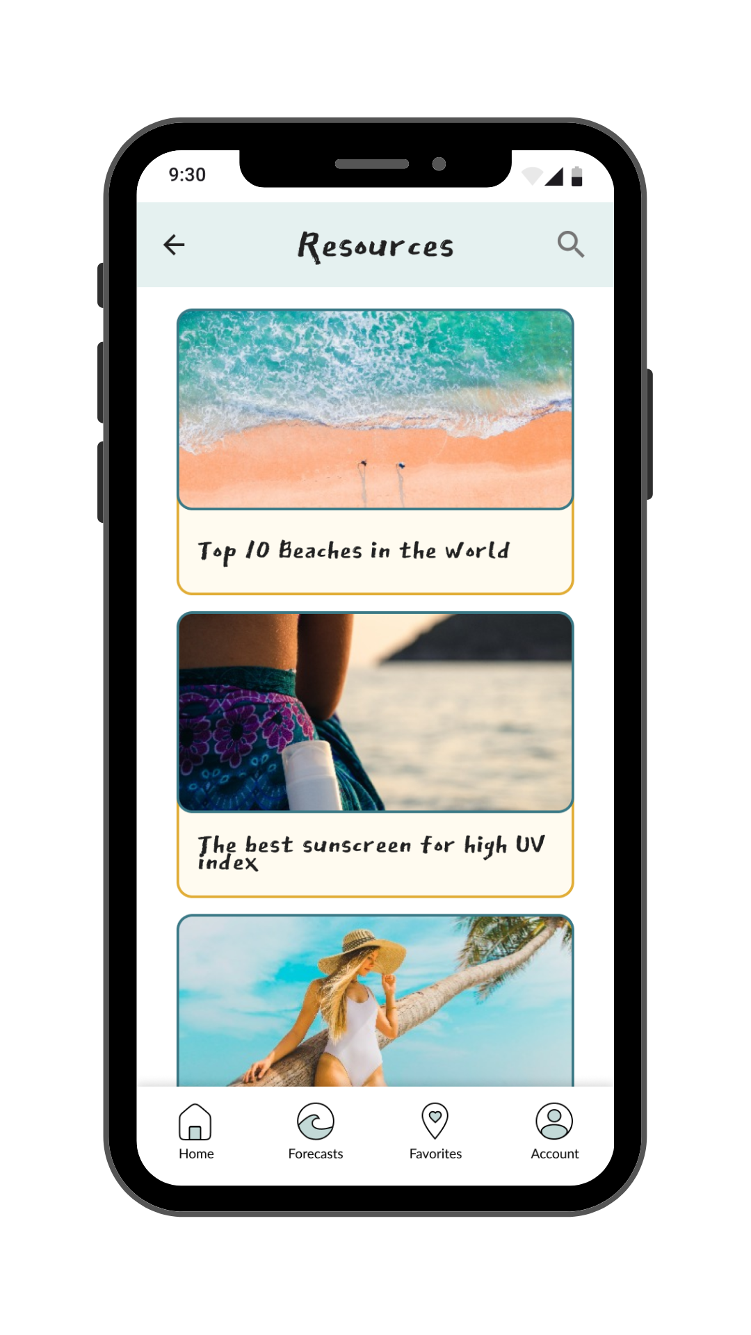
As a solution, I split the content into two separate pages: "Resources" and "Using Vela," both accessible from the new home screen.
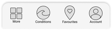
Improving Navigation
With the revival of the home screen I had to update the navigation bar.
Old Navigation Bar

New Navigation Bar
-

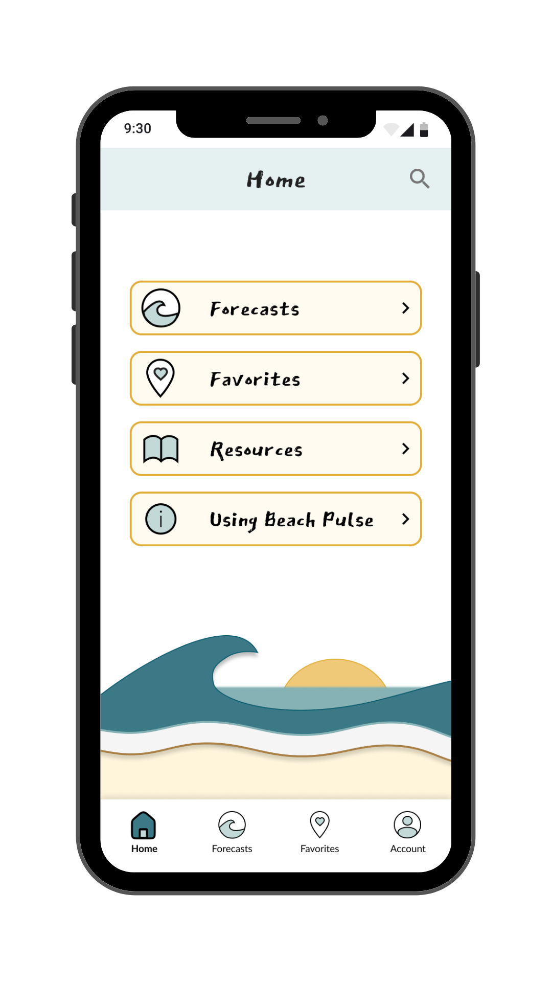
New Home Page
-

Separate Resources Page
-

New Using the App Page
Refining the Design
While developing the Style Guide, it quickly became clear that the app itself was in need of an entire overhaul. Equipped with a more fulsome understanding of Material Design 3 I began my revision process, and Beach Pulse was born out of Vela.
Conditions Cards

Version One
I wanted the day to be viewable at a glance, but in the first version this came across a little cluttered.

Version Two
I made it more in line with Material Design 3 and simplified the iconography.
Version Three
I moved to make it more my own and in line with a grid system to enable responsive design.

Favorites
While I wanted the information for each location to be viewable at a glance, I realized this would be redundant as upon a click it would take you to the Conditions Snapshot with all this information.
So in the updated version I reduced the amount of up-front information and opted to create it more in a list style, and less of a card style. Which resulted in a more simple, visually pleasing look.
Improving Consistency
Up until this point I had been messing around with several similar, but slightly different, color palettes and had kept the font simple as Roboto. While developing the Style Guide and Design Language System I made several changes to make the design more interesting and consistent.


Current Design
Bringing it all together.


Beach Pulse for Desktop
Outcomes
Lessons Learned
I think the biggest lesson was to stick to design conventions. I thought because of the simple nature of the design a Home screen wouldn’t be necessary, effectively overlooking how most users approach an app. It would have saved me time if I stuck to having a Home screen the whole way through.
Future Iterations
In the short term, I would love to add more animations to bring information like wind speed & direction, and wave size to life.
Long-term plans include integrating features suggested during interviews: interactive profiles for users to message each other, review locations with real-time data, and collaborate on trip planning.